Empty Pipes
Approximate Flight Time Map
The map below shows the approximate flight time (in hours) from any location on earth to any other.
- Double click to change the starting point (sorry mobile users!).
- Click and drag to pan
- Scroll to zoom in and out
- Click on the Flight Times and Flight Paths checkboxes to toggle the displayed lines
- New Zealand is opposite Madrid on the globe.
- Ecuador and Colombia are opposite Indonesia
- If you wanted to fly direct from New York to Jakarta, you would have to go either directly north or directly south
- It would take a commercial airliner about 22 hours to fly halfway around the globe.
The red lines above indicate equal distances of approximately 1660 km, from the starting location. This distance corresponds to (very) roughly two hours of flight time in a commercial airliner. The actual time would depend on the type of plane, wind conditions, trajectory and a host of other factors that are omitted for simplicity.
The flight paths option, when checked, shows the path a flight might take when going to any point on the globe. Notice that no matter which direction it goes in, it will always go over the opposite side of the earth if it flies long enough.
The more observant of the viewers will notice that the distances and paths above are equivalent to rotated latitudes and longitudes where the ‘topmost’ point is not the north pole, but rather the location chosen as the starting point. If there is a proper name for these rotated meridians and parallels please let me know.
Background
Is it further to fly from Madrid to Los Angeles or from Helsinki to Los Angeles?
Think about it. If you’re anything like me, you would have guessed Madrid, and you
would have been wrong. Madrid is about 9300 km from LA, while Helsinki is 9000 km,
as the plane flies.
What gives? Well, essentially the earth is a sphere (mostly), and the map is distorted. A plane flying from Helsinki to LA would actually start off flying north-west rather than south-west (where LA appears to be), because it would be flying along the great circle which contains both LA and Helsinki (or Madrid). Because the flight goes over the ‘top’ of the world, it’s actually slightly shorter than the flight from Madrid, that has to go around nearer to the equator.
Other interesting facts that one can glean from this map:
Credits
Thanks to patricksurry’s block for an example of how to implement a rolling pan and zoom with d3.js.
Errata / Disclaimer
Everything is an estimate. Rounding errors abound. Don’t use this for anything but entertainment and curiosity. But you already know that.
Isochrone Maps of Europe
Edit: Any time you see ‘train’ below, it should technically be public transport. The vast
vast majority of the travel used to make these maps is by train, but a very small percentage may
involve ferries or buses.
Below is a map showing how long one would expect to travel to any point in Europe
starting in Vienna, using only trains and walking at a brisk rate of 5 min / kilometer.
Other Cities
Errata / Disclaimer
Everything is an estimate. Rounding errors abound. Don’t use this for anything but entertainment and curiosity. But you already know that.
Some data may be missing. There may be faster connections.
If you find issues, please let me know
and I’ll do my best to fix them.
Thanks to cuicuit on reddit and
@yorksranter for pointing out missing data
for Paris and London! This data has been added.
Travel times to areas close to the coasts are prone to large errors. This is
because travel times are calculated and interpolated on a grid. Points in the
water are heavily penalized so if a city lies between points sampled on land
and water, the interpolated time may be extraordinarily large. Thanks to @ChristianTanner for
pointing this out for the very stark example of Dublin, where it appears that
it takes 14 hours to travel from Dublin to Dublin.
Ireland and parts of Spain are not well represented due to missing data.
How it’s made, technically
I used the Swiss public transport API to get travel times to most other small-medium sized cities in Europe. Then I created a rectangle enclosing most of Europe (the borders of which can be seen in the maps for Stockholm, Helsinki and some of the Baltic countries), and divided it into a grid (200 x 200 points). For each point in this grid, I calculated the fastest way to get to it assuming that the distance between the any train station and that point can be walked at a rate of 5 minutes / kilometer. Any points on water were assigned a swimming rate of 100 minutes / kilometer in order to create dense contours at the coasts.
This grid was used as an input to conrec.js which created a set of contour lines.
These lines were then plotted as a paths using d3.js on top of a leaflet.js
layer using the Stamen maps tiles. These tiles
were chosen because they provide tile sets containing the borders and labels
which can be overlayed on top of the colored contour plot.
The legend is its own div positioned directly below the map. The color map is cubehelix, which provides a nice range from dark to light tones while providing intermediate colors to distinguish the different contours.
Background Information and Motivation
While browsing twitter, I recently came across this wonderful isochrone map of the travel times by train from Vienna to the surrounding region at the turn of the century. As happy resident of Vienna, an avowed admirer of trains, and an ardent afficionado of maps, that map strikes a strong chord with me not only for its historic cachet but for its clean design and aesthetic appeal. It conjured images of steam trains (were the trains in 1900 still running on steam?) chugging along between the imperial centers of Vienna and Budapest. It made me wonder about how people commuted from the train station to their final destination. It made me question my conception of how long it took to get from place to place. Most of all, however, it made me wonder what such a map would look like today.
Having toyed with the idea of plotting travel times by train in a previous post, the map at Alternative Transport, along with Beau Gunderson’s route times in Seattle, made me realize that contour lines are a much better way of presenting the information. Relying on shades of a color makes it difficult to distinguish difference between disparate points on the map as well as to convert to an absolute value. Questions such as “how much darker is point A than point B?” and “what actual time does a particular shade correspond to?” are resolved using the interactive maps (i.e. Vienna, Paris, London, Berlin), but these fail to provide the information at a mere glance. A map containing contour lines corresponding to the locations which can be reached in a particular amount of time provides a clear and concise comparison between the travel times to various locations as well as a concrete reference to the absolute time required to reach a particular point. An example of such a map, called an isochrone map, is provided for Vienna above.
Europe by Train
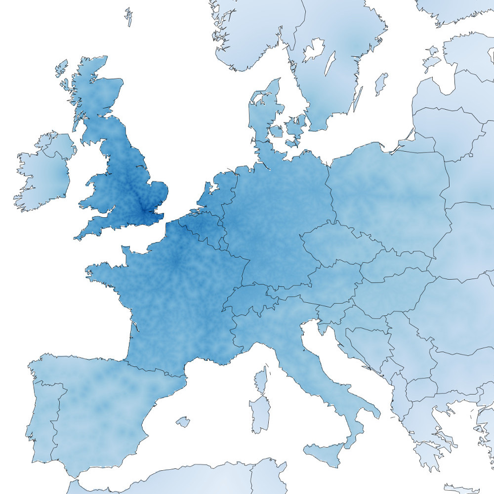
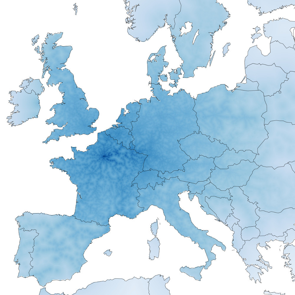
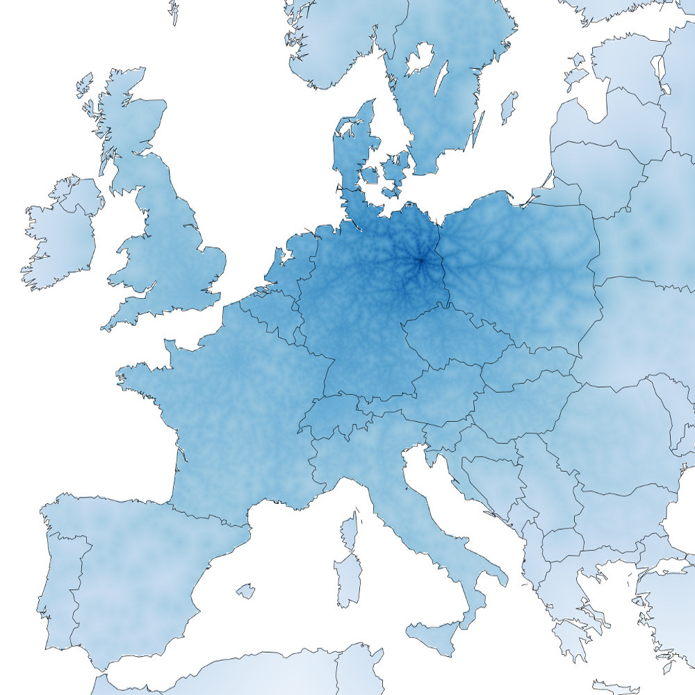
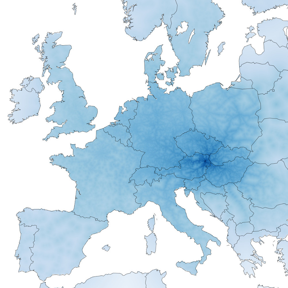
I like travelling. I like trains. I don’t particularly like making decisions. Thus when deciding where to travel to with a train, it would be nice to know which areas are accessible. Taking inspiration from Beau Gunderson’s route times in Seattle, I decided to create maps showing which places are accessible by train from four of Europe’s major cities: London, Paris, Berlin and Vienna.
The methodology is simple. I used the Swiss public transport API to get the best connection between the start city (London, Paris, Berlin and Vienna) and every other city in Europe (huge thanks to @internetztube for a listing of European trains stations). Then I created a grid over all of Europe and interpolated the time to each point on the grid by assuming that any location that wasn’t a train station could be walked to at a rate of 10 minutes per kilometer. The results show a interconnected web of easy-to-reach locations criss-crossing the disconnected countryside.
Darker blue colors indicate a shorter travel time. Colors are proportional to the log of the total estimated travel time. No legend is provided, but clicking on the image leads to a larger interactive version overlayed on OpenStreetMap.


 London
 Paris
Paris Berlin
 Vienna