Empty Pipes
Cambridge Tree Map
The city of Cambridge, MA maintains a wealth of geographic information on its GIS website. One of the more unconvential datasets is the list of trees lining the streets of the city. It contains the position and species of around 30 thousand trees and can be explored using the Cambridge Tree Walk) application. While this app is incredily detailed and useful at high resolution, it loses all information at low resolution. The identities and positions of the trees are lost. And if they weren’t they would be too dense to display in a meaningful and intelligible manner.
To provide a different view, I calculated which tree species is most common on each block in Cambridge and plotted the results using D3.js. The analysis shows that Maple trees dominate the landscape in Cambridge. Further down the list are Oaks, Lindens and Pears. While these are the most common trees on most street blocks in Cambridge, there are a few which are dominated by less common species. This isn’t to say that those species are only found on those blocks, just that those are the only blocks where those species are in the majority.
How useful is this map? I don’t know. But it was fun to make and will hopefully serve as a decent example for introducing how D3.js can be used for cartography at Maptime Boston. A tutorial describing how this map is made is available on the GitHub page for the project. It’s also avilable as a block.
Panning and Zooming with D3v4
All that’s necessary for panning and zooming is a translation [tx, ty] and a scale factor k. When a zoom transform is applied to an element at position [x0, y0], its new position becomes [tx + k × x0, ty + k × y0]. That’s it. Everything else is just sugar and spice on top of this simple transform.
The major difference between zooming in D3v3 and and D3v4 is that the behavior (dealing with events) and the transforms (positioning elements) are more separated. In v3, they used to be part of the behavior whereas in v4, they’re part of the element on which the behavior is called.
To illustrate, let’s plot 4 points. The rest of this post will only deal with data in one dimension. It should be trivial to expand to two dimensions. The points will represent the values 1, 1010, 1020 and 5000:
    var xScale = d3.scaleLinear()
        .domain([0,5000])
        .range([100,500])

    var dataPoints = [1,1010,1020,5000];

    gMain.selectAll('circle')
    .data(dataPoints)
    .enter()
    .append('circle')
    .attr('r', 7)
    .attr('cx', function(d) { return xScale(d); });
We can see that two of the points, 1010 and 1020, are virtually on top of each other.
Using our xScale, we can determine that they’re less than 1 pixel apart.
    xScale(1010) //180.8
    xScale(1020) //181.6
What if we want to zoom in so that they’re 10 pixels apart? We’ll first need to calculate the scale factor, k:
var k = 10 / (xScale(1020) - xScale(1010)) //~ 12.5
Let’s say we want the point 1010 to be positioned at pixel 200. We need to determine tx such that 200 = tx + k × xScale(1010)
var tx = 200 - k * xScale(1010) //-2600
When we apply this to our plot.
    var k = 10 / (xScale(1020) - xScale(1010))
    var tx = 200 - k * xScale(1010)
    var t = d3.zoomIdentity.translate(tx, 0).scale(k)

    gMain.selectAll('circle')
    .data(dataPoints)
    .enter()
    .append('circle')
    .attr('r', 7)
    .attr('cx', function(d) { return t.applyX(xScale(d)); });
We get two lovely separated circles.
Fantastic, right? But notice that the top axis still refers to the old domain. This is
because we never changed it. In the old version of D3, we would attach the axis to the
zoom behavior, set the translate and scale properties and be done with it. In v4,
we have to rescale our linear scale manually and use the rescaled version to create the
axis:
    var xNewScale = t.rescaleX(xScale)

    var xTopAxis = d3.axisTop()
    .scale(xNewScale)
    .ticks(3)
The examples above demonstrate how the zoom transforms work, but they don’t actually use the zoom behavior. For that we need to create a behavior and attach it to an element:
    var circles = svg.selectAll('circle');
    var zoom = d3.zoom().on('zoom', zoomed);

    function zoomed() {
        var transform = d3.event.transform;

        // rescale the x linear scale so that we can draw the top axis
        var xNewScale = transform.rescaleX(xScale);
        xTopAxis.scale(xNewScale)
        gTopAxis.call(xTopAxis);

        // draw the circles in their new positions
        circles.attr('cx', function(d) { return transform.applyX(xScale(d)); });
    }

    gMain.call(zoom)
Here we recompute the zoom transform every time there is a zoom event and
reposition each circle. We also rescale the x-scale so that we can use it to
create an axis. The astute observer will note that
transform.applyX(xScale(d)) is actually equivalent to xNewScale(d).
Automatic rescaling was possible using v3 by calling zoom.x(xScale), but this
has been done away with in favor of explicit rescaling using
transform.rescaleX(xScale).
The code above works but if we had programmatically zoomed in beforehand (as we did in the previous section by applying the transform), then applying the zoom behavior would remove that transform as soon as we start zooming.
Why?
Because in the zoomed function we obtain a transform from
d3.event.transform. In previous versions of D3, this would come from the
zoom behavior itself (zoom.translate and zoom.scale). In v4, it comes from
the element on which the zoom behavior is called (gMain). To programmatically
zoom in and then apply the zoom behavior starting from there, we need to set the
zoom transform of the gMain element before we call the behavior:
var k = 10 / (xScale(1020) - xScale(1010))
var tx = 200 - k * xScale(1010)
var t = d3.zoomIdentity.translate(tx, 0).scale(k)

gMain.call(zoom.transform, t);
gMain.call(zoom)
Now we start with an already zoomed in view and can zoom in and out using the mouse.
To wrap up this post, let’s combine these techniques to create a figure which automatically zooms between random data points (a la M. Bostock’s Zoom Transitions Block). How do we do this?
First, we need a function to call every time we want to jump to a point:
    let targetPoint = 1010;

    function transition(selection) {
        let n = dataPoints.length;
        let prevTargetPoint = targetPoint;

        // pick a new point to zoom to
        while (targetPoint == prevTargetPoint) {
            let i = Math.random() * n | 0
            targetPoint = dataPoints[i];
        }

        selection.transition()
        .delay(300)
        .duration(2000)
        .call(zoom.transform, transform)
        .on('end', function() { circles.call(transition); });
    }

    circles.call(transition);
This function picks a random point (targetPoint) and calls a
transition on the selection. In our case, the selection will be the circles.
When the transition is over, we simply call the function again to start it
over.
Second, we need a transform to center the view on the target point:
    function transform() {
        // put points that are 10 values apart 20 pixels apart
        var k = 20 / (xScale(10) - xScale(0))
        // center in the middle of the visible area
        var tx = (xScale.range()[1] + xScale.range()[0])/2 - k * xScale(targetPoint)
        var t = d3.zoomIdentity.translate(tx, 0).scale(k)
        return t;
    }
And that’s all. Just remember, when zooming and panning the position of the transformed point [x1,y1] = [tx + k × x0, ty + k × y0]. Everything else is just window dressing.
Isochrone Driving Maps of the World
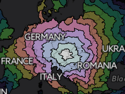
One of my favorite things about maps is the context they provide for overlayed information. This can range from the mundane and orthodox (such as roads and boundaries) to the esoteric and abstract. Nearly a year ago I wrote a blog post which overlayed travel time (isochrone) data on top of a map of Europe. It showed how long it would take somebody to travel from a given city to any other point in Europe using only public transportation. In this post, I do the exact same thing using driving times.

Driving times starting in Vienna, Austria. Notice how the frontier of the contours is more rounded than in Lincoln, NE.

Driving times starting in Lincoln, Nebraska.
The wonderful thing about portraying driving times is that it's possible to make such maps for cities from all over the world. In doing so, we can see the how the transportation infrastructure of a region meshes with the natural features to create a unique accessibility profile. Lincoln (Nebraska) is centered in the USA and has a characteristic diamond shaped travel time profile. Why? Anyone that has looked at a map of the region will certainly have noticed that the roads are arranged in a grid pattern. Thus it takes much longer to travel along the diagonal than to travel straight north and south. Vienna, Austria, on the other hand, has a more circular accessibility profile due to the abundance of roads going in all directions.
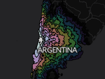
The Andes mountains block driving to the east of Santiago, Chile
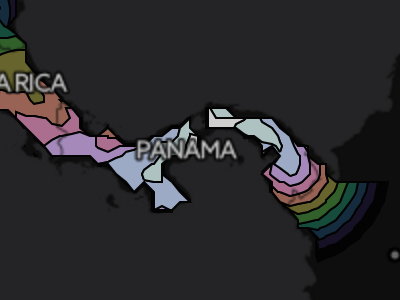
The Darien Gap separates Central America from South America
Looking at the isochrone map of Santiago, Chile, one can clearly see the how the Andes mountains block travel east of the city. Southeast of panama city, the odd fact that you can’t drive between North / Central America and South America becomes clear. Zooming in at identical levels, you can compare cities and see the difference in accessibility of the relatively wealthy South Africa with that of the less developed, wilder Congo. The differences in accessibility between different cities of the world can range from the trivial (Denver, CO vs Lincoln, NE) to the substantial (Perth, Australia vs. Sydney, Australia). Individual cities can have a wide automobile-reachible area (Moscow, Russia) or a narrow, geography, politics and infrastructure-constrained area (Irkutsk, Russia).
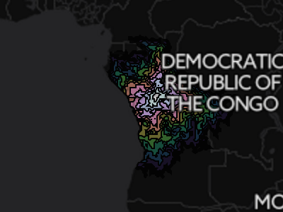
The accessibility profile of Kinshasa, Democratic Republic of the Congo is rugged and discontinuous.
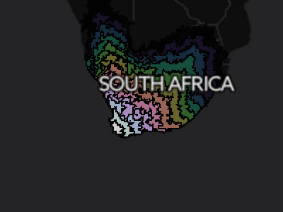
Cape Town, South Africa has good links to the interior of the country as well as to Namibia in the north.
Whatever the case, the places that are most interesting are always those that are also most familiar. For this reason, I’ve provided overlays for most major cities around the world. The map currently shows Vienna, but clicking any of the links below will open a map for that particular city. The travel times were obtained using GraphHopper and OpenStreetMap data so don’t be surprised if they differ from those of Google maps.
Other Cities
Errata / Disclaimer
Everything is an estimate. Rounding errors abound. Don’t use this for anything but entertainment and curiosity. But you already know that.
Some data may be missing. There may be faster routes. Google Maps certainly finds some better ones. If you find issues, please let me know and I’ll do my best to fix them.
How it’s made, technically
For each starting city, an area encompassing 30 degrees north, east, south and
west was subdivided into a .1 degree grid. Directions from the starting city to
each point were calculated using
graphhopper and the OSM map
files. From this, contours were extracted using matplotlib’s contourf
function. These contour files are stored as JSONs and loaded as a D3.js
overlay on top of a leaflet map.
All of the code used to create these maps is on github. If you have any questions, feel free to ask.
Background Information and Motivation
This project was a logical extension of the isochrone train maps of Europe project.