Empty Pipes
Isochrone Driving Maps of the World
One of my favorite things about maps is the context they provide for overlayed information. This can range from the mundane and orthodox (such as roads and boundaries) to the esoteric and abstract. Nearly a year ago I wrote a blog post which overlayed travel time (isochrone) data on top of a map of Europe. It showed how long it would take somebody to travel from a given city to any other point in Europe using only public transportation. In this post, I do the exact same thing using driving times.

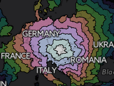
Driving times starting in Vienna, Austria. Notice how the frontier of the contours is more rounded than in Lincoln, NE.

Driving times starting in Lincoln, Nebraska.
The wonderful thing about portraying driving times is that it's possible to make such maps for cities from all over the world. In doing so, we can see the how the transportation infrastructure of a region meshes with the natural features to create a unique accessibility profile. Lincoln (Nebraska) is centered in the USA and has a characteristic diamond shaped travel time profile. Why? Anyone that has looked at a map of the region will certainly have noticed that the roads are arranged in a grid pattern. Thus it takes much longer to travel along the diagonal than to travel straight north and south. Vienna, Austria, on the other hand, has a more circular accessibility profile due to the abundance of roads going in all directions.
The Andes mountains block driving to the east of Santiago, Chile
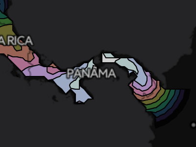
The Darien Gap separates Central America from South America
Looking at the isochrone map of Santiago, Chile, one can clearly see the how the Andes mountains block travel east of the city. Southeast of panama city, the odd fact that you can’t drive between North / Central America and South America becomes clear. Zooming in at identical levels, you can compare cities and see the difference in accessibility of the relatively wealthy South Africa with that of the less developed, wilder Congo. The differences in accessibility between different cities of the world can range from the trivial (Denver, CO vs Lincoln, NE) to the substantial (Perth, Australia vs. Sydney, Australia). Individual cities can have a wide automobile-reachible area (Moscow, Russia) or a narrow, geography, politics and infrastructure-constrained area (Irkutsk, Russia).
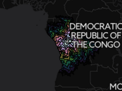
The accessibility profile of Kinshasa, Democratic Republic of the Congo is rugged and discontinuous.
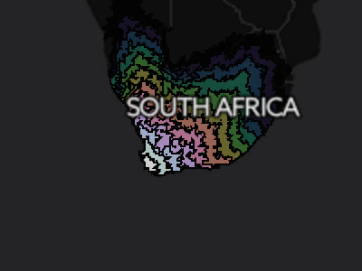
Cape Town, South Africa has good links to the interior of the country as well as to Namibia in the north.
Whatever the case, the places that are most interesting are always those that are also most familiar. For this reason, I’ve provided overlays for most major cities around the world. The map currently shows Vienna, but clicking any of the links below will open a map for that particular city. The travel times were obtained using GraphHopper and OpenStreetMap data so don’t be surprised if they differ from those of Google maps.
Other Cities
Errata / Disclaimer
Everything is an estimate. Rounding errors abound. Don’t use this for anything but entertainment and curiosity. But you already know that.
Some data may be missing. There may be faster routes. Google Maps certainly finds some better ones. If you find issues, please let me know and I’ll do my best to fix them.
How it’s made, technically
For each starting city, an area encompassing 30 degrees north, east, south and
west was subdivided into a .1 degree grid. Directions from the starting city to
each point were calculated using
graphhopper and the OSM map
files. From this, contours were extracted using matplotlib’s contourf
function. These contour files are stored as JSONs and loaded as a D3.js
overlay on top of a leaflet map.
All of the code used to create these maps is on github. If you have any questions, feel free to ask.
Background Information and Motivation
This project was a logical extension of the isochrone train maps of Europe project.