Empty Pipes
Wikipedia's Climate Data on an Interactive Map
Introduction
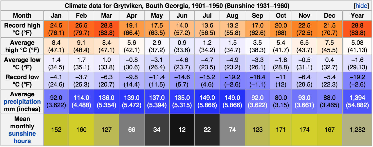
One of my favorite things about Wikipedia is that most cities have a ‘weather box’ which shows historical climate data such as sunshine hours, maximum and minimum temperatures, precipitation and various other interesting statistics:
It’s fun to compare the values for different cities. Are summers in Vienna warmer than in Zürich (yes)? Is Seattle rainier than New York City (no!)? What are the sunniest regions in the world? What about the rainiest? This often involves jumping from page to page or opening up two browser windows to compare values. Couldn’t we make it easier? What if we could see all the values for every place for which there was data at once? What if we could show how the global weather changes over the course of the year?
|
|
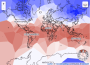
|
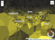
| Sunshine | Precipitation | Daily High |
The animations above show how the world’s climate changes over the year, as documented in Wikipedia’s weather boxes. Sunshine mostly follows a predictable pattern following the seasons, bright in the northern hemisphere from April to October and vice versa. A few exceptions stick out, such as the prominently cloudier regions over the equatorial land masses, which largely correspond to the rainforests of the Amazon, Mid-Western Africa and Indonesia, Malaysia, and Papua New Guinea.
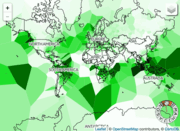
These rainy regions are easily recognized in the middle animation above, which show how the precipitation changes over the year. As expected the rainiest regions are where we find rainforests near the equator, as well as along the coast of British Columbia and northern Washington in the US. A few rainy islands in the Pacific and South Atlantic are shown with disproportionately large areas due to the lack of any other weather stations nearby (see the description of the map below).
The temperature map is also as expected, wherein the temperatures follow the seasons. Most striking, perhaps, is how much the temperatures change over the large landmasses of North America and Siberia, as compared to the oceanic regions. The astutue eye may also notice persistently colder temperatures over Tibet, Mongolia and Central China due to their high elevation.
These animations were created by recording interactions with the map described below.
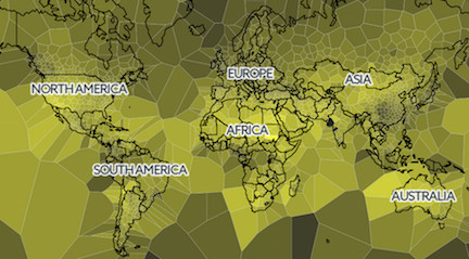
The Map
The map below contains a Voronoi diagram overlay where each cell is color coded according to the climate data for the location defining that point (default is sunshine). Moving the mouse over any cell will show the city it corresponds to as well as its climate data.
A time range can be selected using the circular control on the bottom right corner (only works on the desktop version). The letters refer to the months of the year. Dragging one of the handles will extend or contract the range, whereas dragging on the range itself will translate it.
Different climate data overlays can be selected via the icon in the upper right corner.
How It's Made
Data Preparation
- Wikipedia dumps for all the pages are downloaded.
- For each article that has an associated location and weatherbox, I extract the name, latitude, longitude and weatherbox data and store it in a JSON file.
- This file is filtered for for any entries that don’t have sun, precipitation, high and low temperatures
- The final file is used as input to climate-map.js
- All of the code for parsing wikipedia is on github
Interactive Map
- Country outlines were obtained from Johan Sundström’s
world.geo.jsongithub repository - The circular brush was obtained from Elijah Meeks’ bl.ock
- The map itself is displayed using leaflet.js.
- There’s a bottom layer using CartoDB’s Positron Layer, although this is usually covered by up the SVG containing the voronoi diagram.
- There’s a middle layer containing the SVG element with all of the voronoi cells.
- There’s a label-only CartoDB Position Layer.
- Finally, on top of that, the circular brush is used to create the month selector control on the bottom right corner.
- The layer selector control on the upper right hand corner is a hacked facsimile of Leaflet.js’s Layers Control. It’s hacked because the different layers aren’t actually Leaflet layers, but rather different cross sections of the data. Selecting different options triggers a different data bind for the Voronoi cells in the SVG layer.
Related
A similar map is available for historical temperatures at halftone.co.