Empty Pipes
Creating a Grouped Bar Chart in Matplotlib
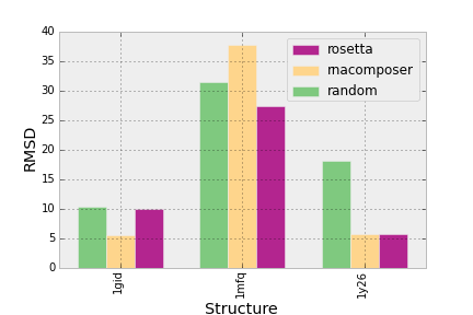
There are many situations where one needs a bar-graph which displays some statistics for different categories under different conditions. In my case, I am interested in how well different programs predict the structures of RNA molecules. Thus the data can be partitioned into the categories (the RNA structures) and the conditions (the prediction programs):
import numpy

dpoints = np.array([['rosetta', '1mfq', 9.97],
           ['rosetta', '1gid', 27.31],
           ['rosetta', '1y26', 5.77],
           ['rnacomposer', '1mfq', 5.55],
           ['rnacomposer', '1gid', 37.74],
           ['rnacomposer', '1y26', 5.77],
           ['random', '1mfq', 10.32],
           ['random', '1gid', 31.46],
           ['random', '1y26', 18.16]])
The Plot
With matplotlib, we can create a barchart but we need to specify the location of each bar as a number (x-coordinate). If there was only one condition and multiple categories, this position could trivially be set to each integer between zero and the number of categories. We would want to separate each bar by a certain amount (say space = 0.1 units). Thus we can define the width of each bar to be width = 1 - space its left-most position as pos= j - (width / 2) where j is the x-coordinate where it should be centered.
If we have n conditions, then we want to place n bars in such a manner that they are centered around j. Note that I keep referring to j since that is where we will place the x-axis labels. So, with n bars, the width of each will be width = (1 - space) / n and its left-most position will be pos = j - (1 - space) / 2 + i * width.
To create the chart, we simply iterate over the conditions and place bars at their prescribed positions:
import matplotlib.pyplot as plt

fig = plt.figure()
ax = fig.add_subplot(111)

space = 0.3

conditions = np.unique(dpoints[:,0])
categories = np.unique(dpoints[:,1])

n = len(conditions)

width = (1 - space) / (len(conditions))
print "width:", width

for i,cond in enumerate(conditions):
    print "cond:", cond
    vals = dpoints[dpoints[:,0] == cond][:,2].astype(np.float)
    pos = [j - (1 - space) / 2. + i * width for j in range(1,len(categories)+1)]
    ax.bar(pos, vals, width=width)
This will yield a very bare bones plot like this:
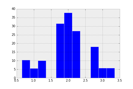
So now the bars are in their appropriate places, but it’s missing some of the essentials of a chart:
Axis ticks and labels
The ticks should correspond to the category names and should be centered under each group of bars. I like to turn them 90 degrees so that they don’t overlap, although in this case it’s not an issue.
ax.set_xticks(indeces)
ax.set_xticklabels(categories)
plt.setp(plt.xticks()[1], rotation=90)
Labels are required to show what we are actually representing.
ax.set_ylabel("RMSD")
ax.set_xlabel("Structure")
Colors and legend
The barebones plot does not distinguish between the different conditions. We need to color each bar and add a legend to inform the viewer which bar corresponds to which condition. The legend will be created by first adding a label to each bar command and then using some matplotlib magic to automatically create and place it within the plot.
The colors will be chosen using a colormap designed for categorical data (colormap.Accent). Thus the original ax.bar function call will be changed to the following:
ax.bar(pos, vals, width=width, label=cond,
       color=cm.Accent(float(i) / n))
And the legend will be created with the following two lines:
handles, labels = ax.get_legend_handles_labels()
ax.legend(handles[::-1], labels[::-1])
This yields a respectable looking bar chart:
Bar Arrangement
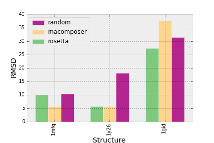
There is one thing that bothers me. The locations of the bars are scattered at the whim of the initial data set. Since the primary purpose of making this plot was to compare different categories and conditions, I would like the locations of the bars and the categories to be ordered to reflect the data. More specifically, the positions of the categories on the x-axis should be ordered by the average values for all conditions of that category and the positions of the bars for each category should be equal to the average value of the condition over all categories.
To do this, I will first calculate the aggregate values for each category and condition and then sort them:
import operator as o

x = dpoints[0]
#dpoints[dpoints

conditions = [(c, np.mean(dpoints[dpoints[:,0] == c][:,2].astype(float)))
              for c in np.unique(dpoints[:,0])]
categories = [(c, np.mean(dpoints[dpoints[:,1] == c][:,2].astype(float)))
              for c in np.unique(dpoints[:,1])]

conditions = [c[0] for c in sorted(conditions, key=o.itemgetter(1))]
categories = [c[0] for c in sorted(categories, key=o.itemgetter(1))]
Then I will sort the original data set so that the data is ordered in accordance with the sorted categories:
dpoints = np.array(sorted(dpoints, key=lambda x: categories.index(x[1])))With this done, I continue creating the plot as before. For convenience, I’ve pasted the resulting plot:
As well as the code needed to produce it:
import matplotlib.pyplot as plt
import matplotlib.cm as cm
import operator as o

import numpy as np

dpoints = np.array([['rosetta', '1mfq', 9.97],
           ['rosetta', '1gid', 27.31],
           ['rosetta', '1y26', 5.77],
           ['rnacomposer', '1mfq', 5.55],
           ['rnacomposer', '1gid', 37.74],
           ['rnacomposer', '1y26', 5.77],
           ['random', '1mfq', 10.32],
           ['random', '1gid', 31.46],
           ['random', '1y26', 18.16]])

fig = plt.figure()
ax = fig.add_subplot(111)

def barplot(ax, dpoints):
    '''
    Create a barchart for data across different categories with
    multiple conditions for each category.

    @param ax: The plotting axes from matplotlib.
    @param dpoints: The data set as an (n, 3) numpy array
    '''

    # Aggregate the conditions and the categories according to their
    # mean values
    conditions = [(c, np.mean(dpoints[dpoints[:,0] == c][:,2].astype(float)))
                  for c in np.unique(dpoints[:,0])]
    categories = [(c, np.mean(dpoints[dpoints[:,1] == c][:,2].astype(float)))
                  for c in np.unique(dpoints[:,1])]

    # sort the conditions, categories and data so that the bars in
    # the plot will be ordered by category and condition
    conditions = [c[0] for c in sorted(conditions, key=o.itemgetter(1))]
    categories = [c[0] for c in sorted(categories, key=o.itemgetter(1))]

    dpoints = np.array(sorted(dpoints, key=lambda x: categories.index(x[1])))

    # the space between each set of bars
    space = 0.3
    n = len(conditions)
    width = (1 - space) / (len(conditions))

    # Create a set of bars at each position
    for i,cond in enumerate(conditions):
        indeces = range(1, len(categories)+1)
        vals = dpoints[dpoints[:,0] == cond][:,2].astype(np.float)
        pos = [j - (1 - space) / 2. + i * width for j in indeces]
        ax.bar(pos, vals, width=width, label=cond,
               color=cm.Accent(float(i) / n))

    # Set the x-axis tick labels to be equal to the categories
    ax.set_xticks(indeces)
    ax.set_xticklabels(categories)
    plt.setp(plt.xticks()[1], rotation=90)

    # Add the axis labels
    ax.set_ylabel("RMSD")
    ax.set_xlabel("Structure")

    # Add a legend
    handles, labels = ax.get_legend_handles_labels()
    ax.legend(handles[::-1], labels[::-1], loc='upper left')

barplot(ax, dpoints)
savefig('barchart_3.png')
plt.show()